Adding pops of color to your home’s exterior can completely transform its curb appeal. While neutral tones are classic, don’t be afraid to use bold and vibrant hues on the outside of your huetiful home. The right colors can make your house stand out on the block, reflect your personality, and even make small spaces appear larger. Follow these tips for selecting eye-catching exterior colors that will bring your home to life.
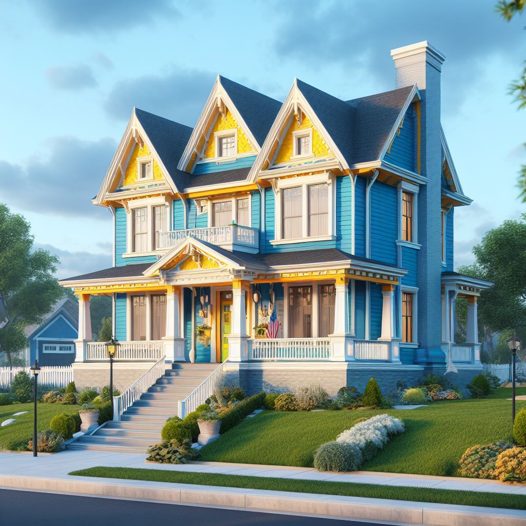
When choosing exterior colors, you’ll want to consider the style of your home and its surroundings. For example, Victorian-style houses often look best with deeper, more saturated colors like Wine Red, Forest Green, or Royal Blue. On the other hand, Craftsman bungalows and cottages pop with lighter earthy hues like Celadon Green and Terracotta.
Think about how much sun your home gets as well. North-facing sides that don’t get much light can handle deeper tones, while south-facing walls bathed in sunlight may look better with lighter accents. Just make sure the colors aren’t so light that they cause glare.
Nothing makes exterior colors stand out more than contrast. Paint your front door or shutters in a bold hue that complements the main house color. For example, Robin Egg Blue shutters can make a vivid statement against a neutral Beige exterior.
You can also use contrasting colors to highlight architectural details. Outline windows, garage doors, and other trim in a darker or lighter tone than the siding. Contrast adds depth, definition, and interest to your home’s facade.
When it comes to painting your home’s exterior, you’ll want to choose colors that coordinate well, withstand weathering, and express your personal style. Here are 4 great options to consider:
This vivid mid-tone blue-green hue is eye-catching and refreshing. Aegean Teal looks beautiful on craftsman, Victorian, and traditional home styles. Its gray undertone gives it versatility to complement other colors like whites, grays, and browns. Use Aegean Teal as your main siding or accent color.
This earthy reddish-brown shade is warm and welcoming on any home. As a main exterior color, Canyon Clay exudes organic vibes and works with natural materials like wood and stone. For accents, pair it with neutral shades like beige or gray. The undertones in Canyon Clay also allow it to complement blues and greens.
A go-to gray for modern farmhouse, craftsman, and contemporary homes, Stormy Gray offers a stylish neutral backdrop. Lighter than many grays, it avoids looking bleak or cold. Stormy Gray siding allows vibrant doors, shutters, and other accents to really pop.
For a playful pop of color, brighten up your exterior with cheery Luscious Lemon. This lively, luminous shade brings energy and personality to any home style. Use it strategically on details like front doors, window boxes, trim, or shutters so it doesn’t overwhelm.
With some bold and beautiful hues like these, you can give your exterior a fresh and huetiful new look that showcases your personal flair! Don’t be afraid to take color risks – you can always repaint if you don’t love it.
While contrast is eye-catching, you don’t want your color palette to feel too busy or mismatched. Limit your exterior colors to no more than three or four hues. Choose one main color for the siding or stucco, a secondary color for accents like the front door, and one or two more colors for trim and other details.
Stick to colors that complement each other. Analogous shades like different Hues of Blue create a cohesive look. You can also choose colors equidistant on the color wheel, like Yellow-Green, Red and Blue. This type of triadic harmony also pleases the eye.
Sometimes a tiny home or cottage can feel cramped and closed in. The right exterior colors can actually make a small home appear much more spacious. To create the illusion of added space, avoid using dark colors on a small dwelling. Instead, opt for light, bright, airy Hues like Sky Blue, Buttermilk, and Pale Sage Green.
Also consider painting horizontal surfaces like siding and trim boards a lighter color than vertical surfaces. Light colors also reflect more light, further opening up the facade. Just take care not to go too light or the color may end up looking washed out.
Beyond aesthetics, different exterior colors can actually help create a particular mood or atmosphere for your home. Earthy Browns and Beiges evoke a warm, welcoming, down-to-earth vibe, while Grays feel more sleek and contemporary. If you want an upbeat, energetic feeling, reach for lively Hues like Lemon Yellow, Melon Orange or Hot Pink.
Bolder colors also make a statement that you are fun, bold, and full of personality. Opt for rich tones like Cabernet Red, Regal Purple, or Midnight Blue to express your unique style. Just steer clear of fluorescents and neon shades that can end up looking tacky.
While you may have fallen in love with Lavender Purple or Lime Green, check any rules your homeowner’s association has before painting. Many HOAs restrict exterior colors to more muted earth tones and neutrals. There may also be rules about how many colors you can use. Ask about any requirements or restrictions in advance to avoid having to repaint later.
Never decide on exterior paint colors based solely on those tiny paint chips from the hardware store. Colors look completely different on a full house versus a two-inch square. Instead, paint sample boards using colors you are considering. Paint each hue onto a piece of siding or foam board. Look at the samples outside at different times of day. You might be surprised how much a color changes in morning light versus evening light.
Testing colors on sample boards will prevent you from making an expensive mistake and having to repaint soon after finishing. Only order full gallons of paint once you’re 100% confident in your color choices.
Don’t cheap out when it comes time to buy exterior paint. High quality paint will provide better coverage and last longer. Two coats are ideal, using primer where needed. While darker colors may require a few extra coats, resist the temptation to thin out the paint, which will diminish its durability. Invest in premium quality paint and supplies for a finish that will withstand weathering and wear for years before needing a fresh coat.
Follow your inspiration when painting your home’s exterior. Trust your instincts, embrace bold hues that bring you joy, and don’t worry about following the crowd. Your home should showcase your own personal style. With strategic color combinations and placement, even the most vivid shades can work beautifully to turn your house into a huetiful haven that pops on your block.

Dale is the colorful mind behind HuetifulHomes.com, where he shows you how to create a home that is as fun and fabulous as you are. He has a passion for color and a knack for DIY, with years of interior design experience he shares his tips and tricks on how to create a home that reflects your personality and style. He believes that color is the key to happiness, and he wants to help you make your home more Huetiful.