Is your kitchen looking a little dull and dreary? Are you ready to infuse some life and vibrancy into your cooking space? Look no further than color! Choosing the right hues can completely transform the look and feel of your kitchen.
Here are 6 lively colors that will make your kitchen pop in all the huetiful ways. Get ready to stir up some serious style.
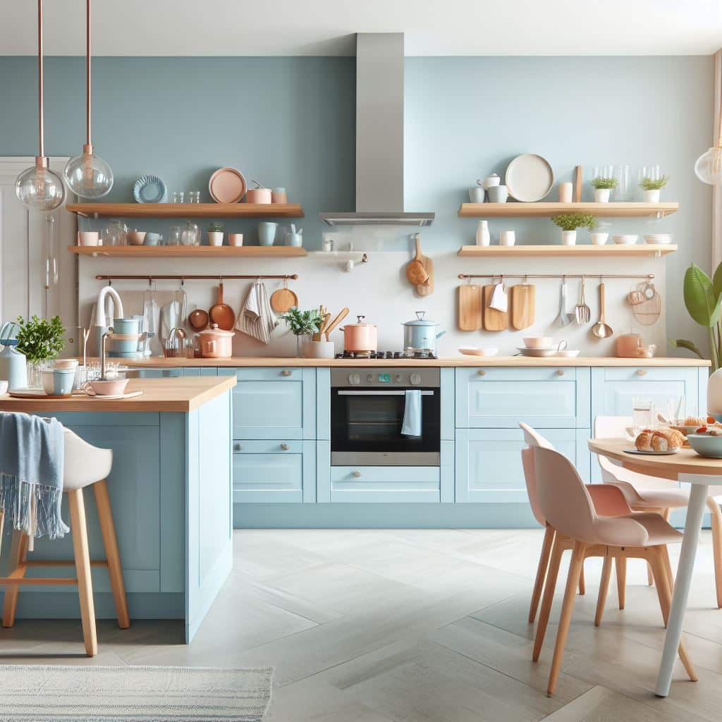
Few colors evoke a sense of vitality quite like sapphire blue. This rich, jewel-toned hue brings a bold punch of color, perfect for the heart of your home.
Sapphire blue works beautifully on kitchen cabinetry and makes for a dramatic statement. For a more subtle look, use it as an accent color on an island or bar stools. This supremely versatile shade pairs nicely with warm metals like brass and also pops against crisp whites.
If you’re looking to infuse your kitchen with energy, chartreuse is the color for you. This eye-catching yellow-green evokes thoughts of springtime and new beginnings. It’s bright, vibrant, and impossible to ignore.
Use chartreuse on your lower cabinets or kitchen backsplash. It looks fantastic paired with dark woods and sophisticated black stainless steel appliances. For a bit of contrast, add in navy blue bar stools or accent pieces. Chartreuse is a lively color that demands attention.
Nothing says warm, feminine charm quite like blush pink. This soft, romantic hue creates a welcoming vibe in any kitchen. Blush pink works beautifully on kitchen walls and instantly makes the space feel more intimate and inviting.
For a really huetiful look, use it on your kitchen island paired with marble or white quartz countertops and brass hardware. Blush pink also pairs nicely with sage green for a soothing, spa-like atmosphere. This color is perfect for whipping up cozy home-cooked meals.
Full of spirit and flair, mustard yellow is having a major moment. This zesty shade is perfect for the kitchen, infusing the space with optimism and cheer. Mustard yellow has vintage appeal but also feels fresh and modern.
Use this lively color on your upper kitchen cabinets or try it on your kitchen island for a pop of color. Mustard yellow also pairs perfectly with moody navy blue kitchen cabinetry for bold contrast. Accent with metallic copper or gold for even more vibrancy. This spirited hue will pump up the volume in your kitchen.
For an earthy yet sophisticated look, you can’t go wrong with rich forest green. This deep jewel tone has an elegant, timeless appeal. Forest green brings a sense of coziness and warmth into any space.
In the kitchen, use forest green on lower cabinetry or kitchen walls. It looks especially huetiful complemented by natural wood countertops and brass hardware. Pair forest green with crisp white upper cabinets for gorgeous two-tone style. Sophisticated and serene, this color choice is always in vogue.
Make a bold, confident statement in your kitchen with burnt orange. This fiery fall hue packs a powerful punch of color. With vintage 1970s appeal, burnt orange reads trendy and on-trend.
Use burnt orange on your kitchen island base or lower cabinets for serious style. It pops beautifully against crisp white countertops and upper cabinetry. For added flair, accent with black hardware and pendant lighting. There’s no better way to spice up your kitchen than with burnt orange’s vibrant energy.
When using vibrant colors in your kitchen, it’s important to keep color theory and balance in mind. The right hue combinations can take your space from chaotic to calmly collected.
Start by choosing one or two main statement colors and use them consistently throughout the kitchen. For example, go bold with navy blue lower cabinets, then carry that color over to bar stools and accent pieces. Repeat colors create a unified, soothing look.
Next, think about the color wheel. Complementary colors like blue and orange or green and red dynamically play off each other. Analogous cool tones like blue, green and violet are harmonious together. Use analogous hues for your main color scheme then add in pops of a complementary color.
Don’t overlook the power of neutrals. Warm neutrals like white, beige and wood tones ground brighter colors. Use plenty of neutral counters, cabinets and backsplashes so vivid hues don’t overwhelm.
Finally, vary color intensities. Balancing deeply saturated shades with softer, muted tones prevents colors from competing. Think navy blue cabinets with a weathered wood island and robin’s egg blue backsplash. Varying color saturations creates visual interest while maintaining harmony.
With mindful color combinations and plenty of neutrals, you can have a colorful, vibrant kitchen that delights the senses, inspires creativity and energizes your cooking. The key is choosing hues that balance and complement each other beautifully.
Dale is the colorful mind behind HuetifulHomes.com, where he shows you how to create a home that is as fun and fabulous as you are. He has a passion for color and a knack for DIY, with years of interior design experience he shares his tips and tricks on how to create a home that reflects your personality and style. He believes that color is the key to happiness, and he wants to help you make your home more Huetiful.