Hey there colorful friends! It’s Dale from HuetifulHomes.com, ready to take you on a vibrant adventure into the world of color theory.Grab your paint brushes and color wheels, because we’re about to unlock the secrets to creating show-stopping rooms brimming with personality. Understanding and applying color theory is like having a superpower – it gives you the skills to transform any space from blah to ta-dah!
So let’s dive in and explore how to use color to create homes that make you smile.
Color theory is an intriguing mix of science, art, and psychology. It’s a conceptual system that explains how colors interact, how they can influence our emotions, and how they can be used to create aesthetically pleasing environments. To fully grasp color theory, it’s crucial to understand its fundamental elements: primary, secondary, and tertiary colors, and the color wheel.
At the heart of color theory are the primary colors: red, yellow, and blue. These colors are the building blocks of all other colors; they can’t be created by mixing any other colors.
When you combine primary colors, you get secondary colors: orange (red + yellow), green (yellow + blue), and purple (blue + red). These colors are a step down from the primary colors but still play a significant role in the color wheel.
But the color fun doesn’t stop there! When you mix a primary color with its adjacent secondary color, you get tertiary colors. These include red-orange, yellow-orange, yellow-green, blue-green, blue-violet, and red-violet. Tertiary colors add depth and variety to the color spectrum, providing an exciting palette for interior design.
The color wheel, a circular diagram of colors arranged according to their chromatic relationship, is an indispensable tool for understanding and applying color theory. It’s a visual representation of the relationships between primary, secondary, and tertiary colors. The color wheel not only guides us in understanding these relationships but also in creating balanced and harmonious color schemes.
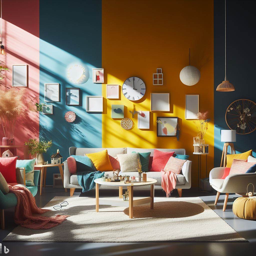
Complementary colors are located directly opposite each other on the color wheel. Examples include red and green, blue and orange, or yellow and purple. When used together, these colors create a high contrast, vibrant look. However, they should be used judiciously to prevent a jarring effect.
Analogous colors are located next to each other on the color wheel. For example, red, red-orange, and orange are analogous colors. These colors create a harmonious, serene look due to their close relationship.
Triadic colors are evenly spaced around the color wheel. An example of a triadic color scheme could be red, blue, and yellow. Triadic color schemes tend to be quite vibrant, even if you use pale or unsaturated versions of your hues.
A split-complementary color scheme involves one base color and the two colors on either side of its direct complement on the color wheel. This provides high contrast like a complementary color scheme but without the strong tension.
Tetradic or double-complementary colors use four colors together, in the form of two complementary pairs. This rich color scheme offers plenty of possibilities for variation and contrast.
Understanding and applying color theory can transform your approach to interior design. It lets you create spaces that are balanced yet interesting, harmonious yet dynamic. From subtle monochromatic rooms to vibrant triadic spaces, color theory is the magic wand that can turn design dreams into reality. So dive in, spin that color wheel, and let the colors play!
Now that we have the basics down, let’s explore how to use these theories in your home.
Elegance in simplicity, that’s the mantra of a monochromatic color scheme. It involves selecting one color and using different shades, tones, and tints of it throughout the room. It’s a great way to create a cohesive, harmonious space.
Analogous colors are next to each other on the color wheel. Think blue, blue-green, and green, or orange, red-orange, and red. This scheme is excellent for creating a serene and comfortable atmosphere.
These are colors directly opposite each other on the color wheel, such as red and green, or blue and orange. Complementary colors are high contrast and high energy – perfect for creating a vibrant, lively space.
This is a variation of the complementary scheme, where instead of using the color directly opposite, you use the two colors next to it. It offers the contrast of the complementary scheme but with less tension.
Color matching – the process of ensuring colors complement each other – is vital in interior design. When colors work in harmony, they create an atmosphere that can influence the mood and comfort level of the room. It’s not about having a keen eye for color (though that helps!); it’s about understanding the principles of color theory and balance.
Every color has a temperature, and no, I’m not talking about the number on your thermostat! I’m referring to its place on the spectrum of warm (reds, oranges, yellows) to cool (blues, greens, purples) hues. Your room should ideally have a balance of both.
Warm colors are energetic, cozy, and comforting. They’re like a hug from your favorite aunt or a sip of hot cocoa on a cold day. Cool colors, on the other hand, are calming, relaxing, and soothing. They’re like a cool breeze on a hot day or the sound of gentle rain against the window.
By balancing these two, you create a room that’s both inviting and calming. For instance, a warm-colored room with a few cool-colored accents creates a welcoming space that’s also tranquil.
The 60-30-10 rule is your golden ticket to a perfectly balanced and visually interesting space. This rule is all about proportion:
This rule ensures that the colors are balanced and that the room feels harmonious. The dominant color provides a unifying backdrop, the secondary color adds interest, and the accent color provides that unexpected pop that makes a room memorable.
Neutrals (whites, greys, browns, and blacks) may seem dull in comparison to our vibrant hues, but they play a critical part in balancing a color scheme. They provide a quiet place for the eye to rest and can help to highlight the other colors in the room.
Remember, these are guidelines, not hard rules. The beauty of interior design is that it’s subjective. What works for one person may not work for another. So feel free to experiment with different color combinations and proportions until you find the balance that feels right for you.
In the end, the goal is to create a space that feels good to you. So play with those hues, mix and match, break some rules if you have to. After all, it’s your huetiful home!
They say light is to space what color is to a canvas and ain’t that the truth! The power of light in the world of color is undeniable. Light, whether it’s natural or artificial, can dramatically influence how we perceive colors. It’s the ultimate mood-setter, the unspoken element that can make or break your room’s color scheme. Let’s delve deeper into the magic of light and color.
The sun, our primary source of natural light, is the ultimate truth teller. Natural light will show the truest colors, bringing out their most authentic shades. Rooms with plenty of natural light are perfect for any color. However, the direction your window faces can also impact how the color appears.
The artificial light in our homes can significantly alter how we perceive colors.
Dark rooms, or rooms with little to no natural light, can be quite challenging. But fear not, color enthusiasts! Here are some tips to brighten up these spaces:
Testing colors in different lighting conditions is critical when selecting the perfect palette for your room. Observe how the color changes throughout the day and under different lights to ensure you’ll love it in every setting.
The interplay between light and color is a captivating dance. Master it, and you can create spaces that are not only visually stunning but also deeply resonant with the desired mood and feel. So get out there, experiment, and let there be light in your huetiful homes!
Color may be the star of the show in interior design, but texture plays a vital supporting role. It’s the secret ingredient that adds depth, dimension, and personality to a room. More than just a tactile experience, texture can significantly influence how we perceive color. Here’s a deeper dive into the fascinating interplay between texture and color.
How we perceive a color can change dramatically based on the texture of the surface it’s applied to. A color painted on a smooth surface can appear lighter and more reflective, as the smooth surface allows more light to bounce back. On the contrary, the same color can appear darker on a rough texture because the uneven surface tends to absorb more light, reducing its reflectivity.
This difference in perception can be used strategically in interior design. If you want a color to stand out, you might place it on a textured surface to add depth and visual interest. Conversely, if you want a color to blend in more subtly, you might use a smoother texture.
Even when you’re working with a single color, texture can save the day and keep things interesting. A monochromatic color scheme, where various shades, tints, and tones of a single color are used, can sometimes feel flat without the added element of texture.
Incorporating different textures can add visual weight and interest to the room. For example, you could pair a sleek leather couch with a soft, fluffy rug, both in the same color. The contrast in textures will break up the monotony, adding richness and depth to the room.
In a multi-color scheme, texture can be a balancing act. When you have a lot of colors competing for attention, different textures can help to harmonize the room.
For instance, imagine a room with vibrant blue walls, a lush green sofa, and fiery red accent pillows. Adding a few neutral-textured elements, like a rough woven rug or a smooth wooden coffee table, can give the eye a place to rest amidst the color chaos. This way, the room feels balanced and cohesive, instead of overwhelming.
Don’t be afraid to mix and match textures in your space. A velvety sofa against a smooth, painted wall, a shiny silk throw pillow on a rough, woven rug, or a glossy ceramic vase on a matte wooden table – the possibilities are endless!
Remember, the goal is to create a room that’s visually interesting and comfortable. So play with different materials – fabrics, metals, woods, ceramics, stones – and see how they affect the colors and the overall mood of your space.
In the end, texture and color are a dynamic duo in the world of interior design. Understanding how they work together can help you create spaces that are not only beautiful and balanced but also deeply engaging to the senses. So go ahead, embrace the power of texture, and let it take your rooms from flat to fabulous!
And there you have it, color chasers – everything you need to know to start playing with color like a pro! Remember, the most important rule is that your home should reflect YOU. So don’t be afraid to break some rules and get creative until you find a color palette that makes your spirit sing.
Color theory simply provides guidance and inspiration. When used right, it’s your key to crafting spaces that perfectly capture your essence and uplift your mood. And isn’t that what every Huetiful Home is all about?
So grab those paint swatches, make some color magic, and create spaces that fill your heart with joy. This is your colorful world – make it as Huetiful as possible!

Dale is the colorful mind behind HuetifulHomes.com, where he shows you how to create a home that is as fun and fabulous as you are. He has a passion for color and a knack for DIY, with years of interior design experience he shares his tips and tricks on how to create a home that reflects your personality and style. He believes that color is the key to happiness, and he wants to help you make your home more Huetiful.